Object Detection with Bounding Boxes
If you want to perform object detection, you need to create a labeled dataset. Use the following template to add rectangular bounding boxes to images, and label the contents of the bounding boxes.
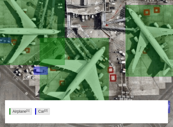
Figure 1: Object detection with bounding boxes.
Create a rotated bounding box
As an annotator, you can also create a rotated bounding box with the “three point click” or “two point click” feature to annotate images.
- First point click - Starting point of the location to draw the bounding box.
- Second point click - Define the rotation and width of the bounding box.
- Third point click - Draw the height of the bounding box.
The origin anchor 0,0 is placed with the first click, similar to the basic bounding box. The second anchor will indicate the angle of the edge for 0,1 and the width of the bounding box. The third and final anchor 1,1 will determine the height or final dimension of the bounding box. Three clicks is required to create a rotated bounding box.
- Starting point of the location to draw the bounding box: With a tag selected and mouse on canvas, on-click to place first anchor
0,0anywhere on the canvas.
note
- The Canvas guides will indicate the orientation and location for the x-axis and y-axis of the crosshair cursor.
- Bounding box label indicates the top and center of the box being created within the canvas. It does not indicate the orientation.
- Define the rotation and width of the bounding box: Move the mouse to the location to place the second anchor.
note
The canvas guides will show you where the cursor is and also indicates the orientation.
To complete the top edge of the box, click and release to place the second cursor.
Draw the height of the bounding box: Again, move the cursor to place the final anchor of the bounding box and complete the creation flow. Now, the bottom edge of the bounding box will follow the cursor to illustrate the height.
Select and rotate the rectangle: Now, you can select and rotate the rectangle without moving the cursor.
After the box has been completed it will remain in selected state, unless determined otherwise.

After you create the bounding box, you can do the following:
- Adjust it by moving the anchors or edges to the desired location on the canvas.
- Determine that the orientation of the bounding box is effected.
- See the orientation of the bounding box and determine the direction during the creation process.
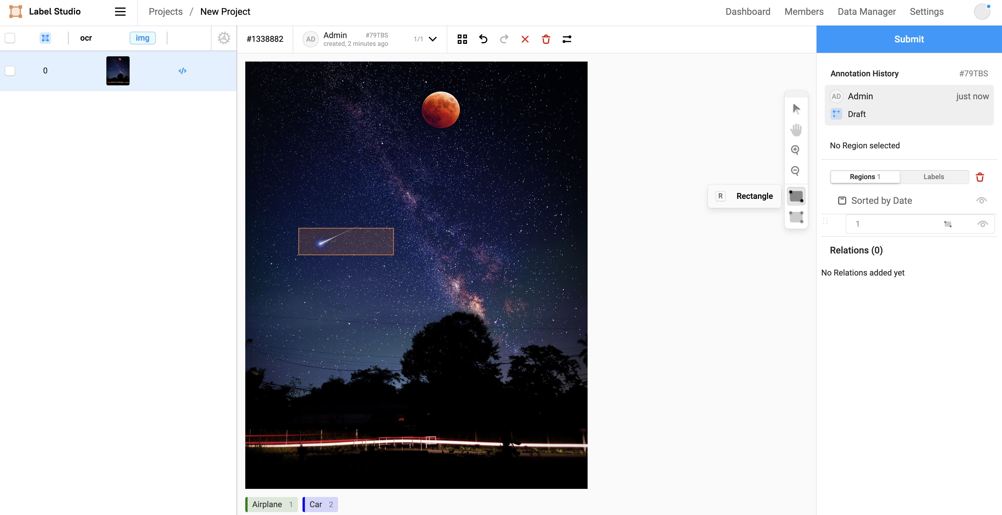
Interactive Template Preview
Labeling Configuration
<View>
  <Image name="image" value="$image"/>
  <RectangleLabels name="label" toName="image">
    <Label value="Airplane" background="green"/>
    <Label value="Car" background="blue"/>
  </RectangleLabels>
</View>
About the labeling configuration
All labeling configurations must be wrapped in View tags.
Use the Image object tag to specify the image to label:
<Image name="image" value="$image"/>Use the RectangleLabels control tag to add labels and rectangular bounding boxes to your image at the same time. Use the Label tag to control the color of the boxes:
<RectangleLabels name="label" toName="image">
  <Label value="Airplane" background="green"/>
  <Label value="Car" background="blue"/>
</RectangleLabels>
Enhance this template
Add descriptions to detected objects
If you want to add further context to object detection tasks with bounding boxes, you can add some per-region conditional labeling parameters to your labeling configuration.
For example, to prompt annotators to add descriptions to detected objects, you can add the following to your labeling configuration:
<View visibleWhen="region-selected">
  <Header value="Describe object" />
  <TextArea name="answer" toName="image" editable="true"
            perRegion="true" required="true" />
  <Choices name="choices" toName="image"
           perRegion="true">
    <Choice value="Correct"/>
    <Choice value="Broken"/>
  </Choices>
</View>
The visibleWhen parameter of the View tag hides the description prompt from annotators until a bounding box is selected.
After the annotator selects a bounding box, the Header appears and provides instructions to annotators.
The TextArea control tag displays an editable text box that applies to the selected bounding box, specified with the perRegion="true" parameter. You can also add a placeholder parameter to provide suggested text to annotators.
In addition, you can prompt annotators to provide additional feedback about the content of the bounding box, such as the status of the item in the box, using the Choices tag with the perRegion parameter.